Classic Chrome vs Classic Negative: Which Fits Your Style?
Debating Classic Chrome vs Classic Negative? Read our Fuji film simulations comparison covering Fujifilm Classic Chrome, Classic Negative, and top recipes.
Every street and travel photographer eventually faces the Classic Chrome vs Classic Negative decision when programming custom slots. Together, Fujifilm Classic Chrome and Classic Negative power more than half of the community recipes in our catalog. Yet these two modes represent opposite analog eras: mid-century photojournalism slides versus nineties Fujicolor Superia consumer print stock.
A practical Fuji film simulations comparison goes beyond marketing labels to show how shadows, skin tones, and skies behave. In this guide, we compare tonal curves, exposure rules, and eight fresh recipes from the FujiPic library. Instead of burying recipes inside dense tables, we explain each setup in short bullets with unedited sample photos.
Classic Chrome vs Classic Negative Side-by-Side Comparison
Before testing individual recipes, you need to see how both base simulations process the exact same raw sensor data. While both modes mute overall saturation compared to Provia or Velvia, they pull shadows and highlights in opposite directions.
Here is the side-by-side technical matrix comparing both base Fujifilm simulations across seven core traits:
| Comparison Trait | Fujifilm Classic Chrome | Fujifilm Classic Negative | What It Means for Your JPEGs |
| Analog Inspiration | 20th-century photojournalism magazine slides | Fujicolor Superia 200/400 consumer print film | Editorial restraint vs nostalgic family album glow |
| Debut Camera & Year | Fujifilm X30 & X-Trans II (2014) | Fujifilm X-Pro3 & Late X-Trans IV (Late 2019) | Classic Chrome runs on older bodies; Classic Neg needs Gen 4+ |
| Shadow Rendering | Cool, neutral-to-cyan documentary shadows | Deep cyan-green shadows with lifted black floor | Classic Neg splits shadow hue away from highlight hue |
| Highlight & Midtone Hue | Muted warm midtones with magenta held back | Warm amber-magenta highlights, slightly clipped | Classic Chrome stays calm; Classic Neg adds chemical warmth |
| Baseline Contrast | Lower midtone contrast until Shadow is boosted | Higher hard-edged contrast built to wake up flat light | Classic Neg punches through overcast skies automatically |
| Recommended Exposure | Meter normally (0 EV) or -1/3 EV for highlights | Slightly overexpose (+1/3 to +2/3 EV) for glowing skin | Underexposing Classic Neg makes skin look muddy and green |
| X-Trans V Blue Rendering | Renders deeper blue on 5th-gen (drop FX Blue 1 step) | Renders deeper blue on 5th-gen (drop FX Blue 1 step) | Use our Recipe Converter when moving from X100V to X100VI |
Read our Complete Guide to Fujifilm Film Simulations to see where both modes rank among all twenty simulations.
How Fujifilm Classic Chrome Shapes Documentary Street Work?
When Fujifilm engineers built Fujifilm Classic Chrome, they studied decades of printed European and American documentary magazines. Rather than copying one single film box, it holds back magenta and lowers saturation to let light lead.
Here are the four tonal behaviors that define Classic Chrome when you build or load a recipe:
- Subdued Color Palette With Held-Back Magenta prevents red brick, neon signs, and flushed skin from overpowering street stories.
- Adding Color +1 to +3 in a recipe restores rich primary warmth on top of that calm documentary foundation.
- Cyan-Leaning Skies and Cool Shadows turn electric blue afternoon skies into sophisticated, timeless magazine teal.
- Warming the White Balance Shift toward red and yellow is the first step in most Classic Chrome recipes.
- Flexible Highlight and Shadow Latitude lets you push shadows hard for gritty noir or drop them for airy travel.
- Because base contrast is lower than Classic Negative, it handles harsh midday sun without choking shadow detail.
Why Classic Negative Delivers Nostalgic Superia Print Glow?
Debuting on the X-Pro3, Classic Negative changed Fujifilm JPEG photography by modeling the chemistry of Fujicolor Superia print film. Instead of shifting all tones in one direction, it pulls highlights and shadows toward opposite ends of the color wheel.
Here are the three chemical traits that give Classic Negative its unmistakable nineties print character:
- Opposing Cyan-Green and Magenta Color Split
Classic Negative embeds a two-way color matrix directly inside the simulation before you even touch White Balance Shift. Darker tones and shadows pull toward cool cyan-green and magenta, while midtones and highlights glow with warm amber. Because standard camera controls move all tones together, no setting can make Classic Chrome replicate this two-way split.
- Built-In Contrast Designed for Flat Light
Fujifilm engineered Classic Negative with strong color contrast and a lifted black floor that mimics chemical darkroom prints. On dreary, overcast afternoons where standard modes look lifeless, Classic Negative carves immediate separation between buildings and skies. However, in harsh midday sun, you often need DR400 or negative Shadow values so contrast does not overwhelm faces.
- Overexposure Sensitivity on Skin and Clouds
Like real consumer negative print film, Classic Negative rewards photographers who nudge their exposure dial slightly toward plus one-third. Lifting exposure pulls faces out of the murky cyan-green shadow zone and places skin into warm, creamy highlights. Pairing DR400 with minus one or minus two Highlight tone keeps bright skies from clipping when you overexpose.
Explore our Fujifilm Recipes for Cloudy Weather guide to see how negative and cinema modes wake up gray skies.
Best Fujifilm Classic Chrome Recipes With Full Specs
To show how versatile Fujifilm Classic Chrome truly is, we selected four fresh recipes from the FujiPic catalog. Rather than listing numbers in a rigid table, these scannable bullet breakdowns explain each recipe’s specs and ideal light.
Here are four distinct Classic Chrome recipes with their key menu settings and real-world shooting behavior:
1. Hard Light Chrome
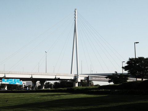
(Midday Street & Architecture Punch): Built for X-Trans IV, X-Trans V, and GFX cameras under bright sun.
- Tone & Texture Settings: Pairs deep highlight and shadow contrast with Sharpness +1, NR -3, Clarity 0, and Strong grain.
- Color & White Balance: Combines vivid yellows and greens with a cool-bluish white balance shift for bold urban geometry.
2. Kodak Softlight

(Warm Everyday Travel & Lush Greens): Built on Classic Chrome for serene outdoor walks and handmade textures.
- Core Menu Settings: Uses Strong Color Chrome, softened highlights, gentle shadows, Sharpness -1, NR -4, Clarity -2, and Weak grain.
3. Quiet Portra 170
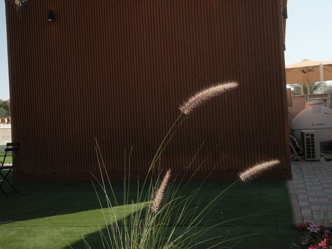
(Gentle Golden Hour & Café Walks): Tuned on Classic Chrome for fifth-generation X-Trans V camera bodies.
- Core Menu Settings: Keeps Color at 0 with Daylight WB, a warm Red/Blue shift, eased sharpness, and softened clarity.
4. Soft Chrome Roll
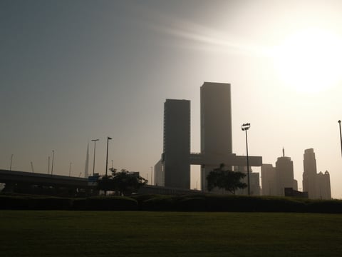
(Retro Slide Vibe): Built on Classic Chrome for X-Trans III, X-Trans IV, and GFX cameras.
- Core Menu Settings: Pushes highlights for graphic architectural lines while softening shadows, adding warm color and Strong grain.
Soft Chrome Roll pairs Classic Chrome with pushed highlights, softened shadows, and strong grain across X-Trans III, IV, and GFX.
Want to copy all fifteen settings for these looks? Open our Fujifilm Recipes catalog to load them into your camera.
Best Four Classic Negative Recipes Explained in Detail
Now compare those calm documentary Chrome setups against four expressive Classic Negative recipes from our FujiPic library. Each setup below uses short paragraphs and bullet specs to show how Classic Negative handles overcast streets and prints.
Here are four fresh Classic Negative recipes with their exact parameter highlights and best lighting conditions:
1. Fine Grain Print (Overcast & Mixed Light)
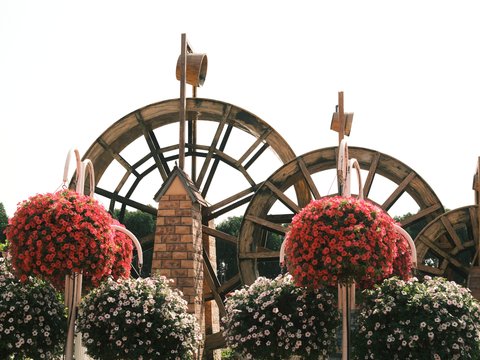
Designed for lively urban walks under overcast skies, Fine Grain Print evokes late twentieth-century consumer color prints. It pairs Classic Negative with subdued highlights, Shadow plus one, Color plus three, Sharpness minus two, and Clarity minus two. Combined with High ISO Noise Reduction minus four, Strong Small grain, and a cool-bluish shift, street colors pop.
Pick Fine Grain Print (Shadow +1, Color +3, Sharpness -2, Clarity -2, Strong Small grain) for overcast street color.
2. Old Ivory Roll (Aged 7350K Documentary)
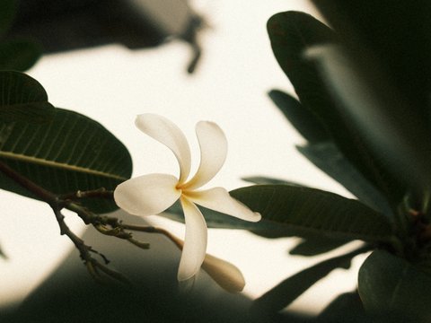
When weathered brickwork and evening streets call for heavy vintage mood, load Old Ivory Roll on Classic Negative. Its settings combine DR400, Highlight plus two, Shadow plus three, Color minus one, Sharpness minus two, and Clarity minus three. A warm 7350K Kelvin white balance (R -1, B -4) with Strong Large grain creates an authentic aged-print finish.
Pick Old Ivory Roll (DR400, H +2, S +3, Color -1, Clarity -3, 7350K) for aged-paper texture.
3. Bygone Season
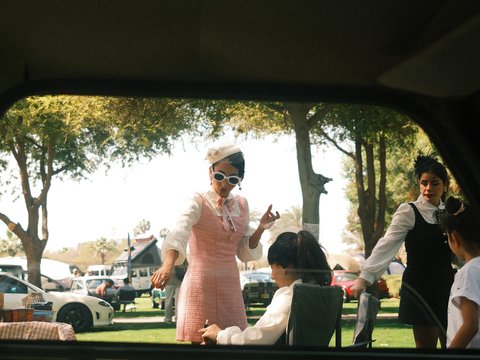
Bygone Season combines subdued colours, warm highlights, and strong grain for a nostalgic late-summer feel. Its softer rendering gives busy markets, narrow streets, and everyday travel scenes a relaxed, almost remembered quality.
Pick Bygone Season when coastal light or colorful signage calls for nostalgic 35mm print character.
4. Aveo Ultra Print

Aveo Ultra Print gives X-Trans IV and GFX photographers a punchy, high-character Classic Negative print look for everyday color. Its postcard-like appearance works particularly well for classic cars, open roads, roadside stops, and sunlit architecture.
Pick Aveo Ultra Print when road trips, classic cars, and colourful urban scenes call for punchy vintage colours and a nostalgic postcard feel.
Aveo Ultra Print uses Classic Negative on X-Trans IV and GFX cameras to deliver nostalgic color separation in camera.
Read our Fujifilm Color Chrome Effect guide to see how Old Ivory Roll and Kodachrome Shade use Chrome depth.
Choosing Classic Chrome or Classic Negative by Scene Today
Once you have both simulations saved in your custom bank, knowing which slot to select takes two seconds. This Fuji film simulations comparison checklist matches your real-world lighting and subject directly to the winning simulation.
Here are the five real-world scene rules for switching between Fujifilm Classic Chrome and Classic Negative:
- Harsh Midday Sunlight: Choose Classic Chrome (Hard Light Chrome or Elite Faded Chrome) because lower contrast prevents crushed shadows.
- Flat Overcast Streets: Choose Classic Negative (Fine Grain Print or Bygone Season) because built-in contrast wakes up dull skies.
- Natural Skin Portraits: Choose softened Classic Chrome (Quiet Portra 170) or overexpose Classic Negative by +1/3 EV for warm skin.
- Golden Hour Walks: Use Soft Gold Retro on Classic Chrome for 1970s warmth or Marigold Afternoon on Classic Negative.
- Neon Night & Mixed Indoor Light: Choose Classic Negative (Warm Night or Vintage Lamplight Tone) for amber-teal cinema separation.
Check our 5 Best Fujifilm Golden Hour Recipes guide for more sunset-tuned Classic Chrome and Classic Negative setups.
Camera Compatibility and X-Trans V Blue Channel Rules Here
Not every camera listed inside our Fujifilm cameras directory includes both simulations inside its internal menu. Even when a camera supports both modes, fifth-generation X-Trans V processors change how blue skies render.
Here are the essential hardware and cross-sensor conversion rules for Classic Chrome vs Classic Negative:
- Missing Classic Negative on Older Bodies: Fujifilm added Classic Negative in late 2019 on X-Pro3, X100V, X-T4, and newer cameras.
- Why you cannot fake it: A global white balance shift on Classic Chrome cannot replicate Classic Negative’s two-way color split.
- What to shoot instead: Load Soft Chrome Roll or Faded Agfa Green on Classic Chrome for X-Trans III and X-T3.
- Deeper Blues on X-Trans V Sensors: Fifth-generation processors render noticeably deeper blue skies in both Classic Chrome and Classic Negative.
- Your one-step fix: Step down Color Chrome FX Blue one level (Strong to Weak) using our free Fujifilm Recipe Converter.
Read our Must-Try Fujifilm X-T5 Recipes guide to see how Color Chrome FX Blue behaves on forty-megapixel sensors.
Find Your Classic Chrome or Classic Negative Look
Classic Chrome and Classic Negative each bring a different character to Fujifilm photographs, from understated documentary colours to nostalgic, contrast-rich film tones. Try a few recipes that match your camera and the scenes you enjoy shooting, then experiment with exposure and white balance to make the look your own.
Classic colours. Nostalgic tones. Your next favourite JPEG is waiting. Explore Fujifilm recipes on FujiPic.
Frequently Asked Questions
1. Is Classic Negative Better Than Classic Chrome?
Neither simulation is universally better because each was engineered for a completely different photographic mood and lighting condition. Fujifilm Classic Chrome is calm, desaturated, and documentary, keeping magenta held back so composition and light take center stage. Classic Negative is punchier and more nostalgic, splitting cyan-green shadows against warm magenta highlights for an instant nineties print look.
2. What Real Film Stocks Do Both Modes Emulate?
Classic Chrome is not modeled on one single film box; instead, it replicates 20th-century photojournalism magazine slide printing. Because of its cyan skies and warm midtones, photographers use Classic Chrome for Kodachrome and Portra recipes. Classic Negative is modeled directly on Fujicolor Superia consumer color negative film from the late nineties and early 2000s.
3. Why Doesn’t My Fujifilm X-T3 Have Classic Neg?
Even though the X-T3 and original X-T30 use the 26.1MP X-Trans IV sensor, they launched before Classic Negative existed. Fujifilm debuted Classic Negative on the X-Pro3 in late 2019 and added it to the X-T4, X100V, and X-S10. If you shoot an X-T3 or X-Trans III body, use our verified Classic Chrome recipes built specifically for your hardware.
4. Can I Make Classic Chrome Look Like Classic Neg?
No, you cannot turn Classic Chrome into a true clone of Classic Negative using in-camera white balance or tone menus. Camera menu controls move every tone in the same direction, whereas Classic Negative splits shadow and highlight hues apart. Rather than fighting your menu, embrace Classic Chrome’s strengths with recipes like Soft Chrome Roll or Hard Light Chrome.
5. Should I Overexpose Classic Negative Recipes?
Yes, Classic Negative usually looks best when you nudge your exposure compensation dial to plus one-third or plus two-thirds EV. Slight overexposure lifts skin tones out of the cool cyan-green shadow curve and gives midtones a warm chemical glow. By contrast, Classic Chrome prefers neutral 0 EV or minus one-third EV exposure so slide-style highlights retain crisp detail.
6. Which Simulation Is Better for Skin Tones?
In open shade or golden hour, softened Classic Chrome setups like Quiet Portra 170 produce calm, flattering complexions. Classic Negative can also render gorgeous nostalgic portraits when slightly overexposed, though high-contrast recipes can make shaded skin look greenish. When accurate, delicate studio skin tones matter most, consider pairing both with an Astia or PRO Neg. Std portrait slot.
7. Why Do Blues Look Darker on X-Trans V Cameras?
Fifth-generation X-Trans V cameras like the X100VI, X-T5, and X-T50 process blue channels more deeply in both simulations. Copying an X-Trans IV recipe with Color Chrome FX Blue Strong directly onto an X-T5 can make skies overly dark. Paste any fourth-generation recipe into our free Fujifilm Recipe Converter to step down FX Blue by one level.
8. Can I Shoot Both Simulations at the Same Time?
Yes, assign Film Simulation Bracketing in your Drive menu to capture Classic Chrome and Classic Negative in one click. Alternatively, shoot RAW+JPEG with Classic Chrome in C1 and re-render any frame as Classic Negative via in-camera RAW Conversion. You can also upload any sample photo to FujiPic Find to see which simulation matches your target aesthetic.