Nostalgic Negative vs Classic Negative: Which Shoots Best?
Debating Nostalgic Negative vs Classic Negative? Compare Fujifilm Nostalgic Negative and Classic Negative to find the best Fuji film look and recipes now.
Choosing between Nostalgic Negative vs Classic Negative is the ultimate creative fork for modern Fujifilm color photographers. Both modes build an unmistakable Fuji film look straight out of camera without needing a single desktop preset. Yet Fujifilm Nostalgic Negative and Classic Negative draw inspiration from two completely different decades of analog color printing.
Where Classic Negative channels gritty nineties Superia snapshots, Nostalgic Negative bathes highlights in warm seventies gallery amber. This practical comparison unpacks their color science, exposure habits, and nine fresh recipes from the FujiPic library. Every recipe below is explained through short, scannable bullet points and sentences alongside unedited camera sample photos.
How Nostalgic Negative and Classic Negative Split Tones?
At first glance, newcomers often lump Fujifilm Nostalgic Negative and Classic Negative together as warm vintage modes. In practice, they split shadows and highlights along completely different color axes inside your camera’s processor.
Here are the three core color-science differences that separate these two analog negative film simulations today:
- 1970s New Color Amber vs 1990s Superia Cyan
Fujifilm engineered Nostalgic Negative around seventies American New Color fine-art prints by pioneers like Stephen Shore. It infuses every highlight and midtone with a golden amber-brown cast while keeping shadows lush and deep. By contrast, Classic Negative models nineties Fujicolor Superia consumer stock, pairing cool cyan-green shadows against magenta-warm highlights.
- Soft Amber Roll-Off vs Hard Edge Contrast
Nostalgic Negative uses a softer highlight curve that prevents bright golden-hour skies from feeling harsh or clinical. Meanwhile, Classic Negative applies a steeper, punchier midtone contrast curve designed to wake up flat overcast streets. Put simply, choose Classic Negative for edgy graphic bite, or choose Nostalgic Negative for warm emotional atmosphere.
- How White Balance Shifts React on Each Base
Because Nostalgic Negative already carries built-in amber highlights, adding a cool blue shift creates faded postcard magic. Conversely, pushing a warm red shift on Nostalgic Negative turns indoor window light into rich honey gold. On Classic Negative, your white balance shift determines whether cyan-green shadows or warm coral midtones dominate.
Nostalgic Negative vs Classic Negative Technical Breakdown
To help you decide which mode belongs in custom slot C1, compare their technical behavior side by side. Both simulations belong to Fujifilm’s negative print family on FujiPic Simulations, yet their hardware and tonal rules differ.
Here is the complete seven-point technical comparison table between Fujifilm Nostalgic Negative and Classic Negative:
| Technical Feature | Fujifilm Nostalgic Negative | Fujifilm Classic Negative | Practical Takeaway for Shooters |
| Analog Era & Inspiration | 1970s American New Color fine-art prints & dye transfer | 1990s Fujicolor Superia consumer 35mm print film | Warm 70s gallery nostalgia vs gritty 90s street snapshots |
| Highlight Tonality | Soft, amber-brown and golden honey highlights | Slightly clipped, warm magenta-orange highlights | Nostalgic Neg softens sunsets; Classic Neg adds crisp bite |
| Shadow Tonality | Rich, deep, warm-neutral shadow density | Cool cyan-green and magenta-leaning lifted shadows | Classic Neg splits shadow hue away from highlight hue |
| Contrast Profile | Gentle highlight contrast with deep shadow richness | High color and tonal contrast built for flat light | Classic Neg punches harder on gray, cloudy afternoons |
| Skin Tone Behavior | Warm amber-bronze glow (watch for orange cast indoors) | Creamy when overexposed (+1/3 EV); greenish if underexposed | Both need careful exposure compensation on portraits |
| Supported X-Series Bodies | X-Trans V & X-Processor 5 bodies (X100VI, X-T5, X-S20, X-M5) | All X-Trans IV (from X-Pro3/X-T4/X100V) & X-Trans V bodies | X100V & X-T4 have Classic Neg, but lack Nostalgic Neg |
| Supported GFX Bodies | GFX100, GFX100S, GFX 50S II, GFX100 II, GFX100RF | All modern GFX medium-format camera bodies | Nostalgic Neg actually debuted on the GFX100S in early 2021 |
- Use Fujifilm Nostalgic Negative when golden hour, coastal boardwalks, or cozy window-lit interiors call for warm amber emotion.
- Use Classic Negative when overcast city streets, rusty signage, or night markets need bold cyan-and-coral contrast.
Explore our Complete Guide to Fujifilm Film Simulations for a full timeline of when each simulation launched.
Five Fujifilm Nostalgic Negative Recipes
Our FujiPic recipes catalog includes five dedicated setups built on Fujifilm Nostalgic Negative for fifth-generation and GFX cameras. Rather than listing settings inside a table, these layered short bulletins explain each recipe’s exact character and specs.
Here are five verified Nostalgic Negative recipes from FujiPic explained in scannable short bullet points:

(Faded Coastal Holiday Album): Turns bright beach paths into sun-drenched vintage summer postcards.
- Core Settings & Look: Pairs Nostalgic Neg., rolled-off highlights, a cool shift, lowered clarity, and Strong Large grain.
- Highland Nostalgia

(Cozy Window Light & Cultural Streets): Blends earthy warmth with softly faded contrast.
- Core Settings & Look: Combines Nostalgic Neg., lowered highlights, a red-shifted white balance, and Large grain for interiors.
- Kodak Sunwashed

(Golden-Hour Markets & Deep Shadows): Captures rich, sun-baked travel warmth with dramatic depth.
- Core Settings & Look: Pairs 4500K (R +2, B -5), gentle highlights, deep shadows, Strong Chrome, and Strong Large grain.
- Matinee Print

(Cinema Fade): Uses 4900K WB, matching red and blue shifts, softened shadows, and Strong Color Chrome.
- Core Settings & Look: Uses 4900K WB, matching red and blue shifts, softened shadows, and Strong Color Chrome.
- Retro Summer
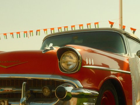
(Carefree Sun): Uses tender halo highlights, muted shadows, a cool pastel-sky shift, and fine Small grain.
- Core Settings & Look: Uses tender halo highlights, muted shadows, a cool pastel-sky shift, and fine Small grain.
Nostalgic Negative recipes on FujiPic wrap golden-hour streets and coastal paths in warm, seventies-inspired amber tones.
Want to unlock all fifteen menu values for these five setups? Visit our Fujifilm Recipes page right now.
Four Classic Negative Recipes Explained
To see how Classic Negative counters that soft seventies amber with nineties street punch, compare four fresh FujiPic setups. Each recipe below is explained through three-sentence blocks and short bullets without using any recipe tables.
Here are four fresh Classic Negative recipes from our library that showcase its signature Fuji film look:
- Old Havana Tone (Timeworn Street & Market)

Built on Classic Negative, Old Havana Tone brings rich, timeworn warmth to bustling street markets and waterfronts. Expanded dynamic range protects bright skies while deep shadows, Strong Color Chrome, and Strong grain add tactile authenticity. A subtle cool cast keeps saturated colors balanced under overcast clouds or golden-hour side light.
- Choose Old Havana Tone (Classic Negative, high DR sky protection, Strong Color Chrome, Strong grain) for textured street markets.
- Kodak Royal Warmth (Mixed Light Urban Glow)
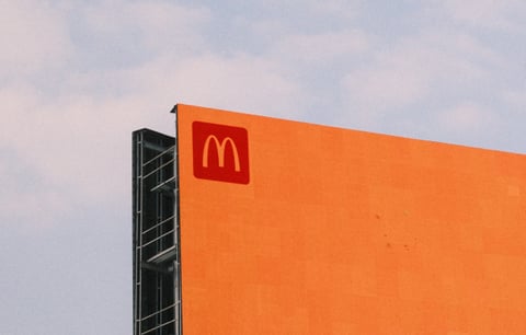
When you walk through lively city neighborhoods at dusk, Kodak Royal Warmth pairs Classic Negative with inviting nostalgia. Gentle highlights and warm, deeper shadows preserve texture across both shaded brick alleys and bright shop windows. Its Strong Small grain setting gives overcast and mixed-light urban explorations a crisp, classic 35mm print finish.
- Choose Kodak Royal Warmth (Classic Negative, gentle highlights, warm deep shadows, Strong Small grain) for mixed city lighting.
- Classic Superia (Vivid Street & Hue Contrast)

For fifth-generation sensors, Classic Superia combines vivid hues, a warm white balance shift, subdued shadows, and Strong Small grain.
- Choose Classic Superia (Classic Negative, vivid hues, warm WB shift, subdued shadows, Strong Small grain) for dynamic street scenes.
- Film Reel Gold (Cinematic Café Glow)
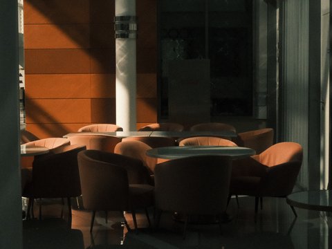
Meanwhile, Film Reel Gold leaves Highlight and Shadow at zero with fixed Daylight WB and boosted Color saturation. By skipping Color Chrome effects and lowering clarity and sharpness with Strong fine grain, Film Reel Gold turns cafés cinematic.
- Choose Film Reel Gold (Daylight WB, H 0 / S 0, raised Color, Strong fine grain) for warm indoor cafés.
Classic Negative recipes deliver bold cyan-shadow and warm-midtone separation across overcast streets and mixed indoor light.
Check our Fujifilm Grain Effect settings guide to see how Strong Small and Strong Large grain transform negative recipes.
How Skin Tones, Shadows, and Exposure Differ on Both Modes?
Because both simulations apply strong analog color styling, pointing them at human faces requires knowing their exposure quirks. A half-stop adjustment on your physical exposure compensation dial changes skin tones dramatically in both modes.
Here is how to manage skin tones, shadow density, and exposure compensation across both negative simulations:
- Protecting Skin in Classic Negative: Underexposing Classic Negative drops cheeks into its cool cyan-green shadow curve.
- The +1/3 to +2/3 EV Rule: Overexpose slightly so faces sit inside the warm, creamy upper-midtone zone.
- Managing Amber Warmth in Nostalgic Negative: Under warm indoor tungsten bulbs, Nostalgic Negative can turn skin overly orange.
- The Cool-Shift Counterbalance: Recipes like Americana Postcard and Retro Summer use a cool WB shift to keep highlights balanced.
- Handling Harsh Midday Contrast: Both simulations can feel heavy under noon sun unless paired with DR400 or Kodak Filmstock.
Read our 5 Best Fujifilm Golden Hour Recipes guide to see how sunset light interacts with warm negative shifts.
When to Pick Each Negative Simulation in Real Lighting Now
Still unsure whether to turn your custom dial to Nostalgic Negative or Classic Negative when stepping outside? Match the ambient light in front of your lens to these five practical scene recommendations.
Here are five everyday outdoor and indoor lighting scenarios that tell you which negative simulation wins:
- Golden Hour Beaches & Coastal Boardwalks: Pick Nostalgic Negative (Americana Postcard or Kodak Sunwashed) for glowing seventies sunset prints.
- Dreary Overcast Urban Streets: Pick Classic Negative (Fine Grain Print or Old Havana Tone) where hard contrast carves depth.
- Cozy Window-Lit Cafés & Bookstores: Test Highland Nostalgia (Nostalgic Neg.) against Film Reel Gold (Classic Negative) for warm indoor mood.
- Harsh Midday Travel Walks: Load Kodak Filmstock on Nostalgic Neg., where soft shadows and DR400 tame noon sun.
- Neon Night Markets & Wet Asphalt: Pick Classic Negative (Warm Night) or Nostalgic Neg. (Midnight Filament) for cinematic night glow.
Explore our 8 Must-Try Fujifilm Night Photography Recipes guide for deeper after-dark settings across city streets.
Camera Compatibility Across X-Trans IV, X-Trans V, and GFX
Hardware support is the single biggest plot twist when comparing Fujifilm Nostalgic Negative against Classic Negative. Checking our Fujifilm cameras directory shows why fourth-generation X-Series bodies only carry one of these two modes.
Here is how sensor and processor generations govern camera access to both negative film simulations today:
Why X100V and X-T4 Lack Nostalgic Negative
Classic Negative debuted in late 2019 on the X-Pro3 and ships on the X100V, X-T4, X-S10, X-E4, and X-T30 II. Fujifilm introduced Nostalgic Negative in early 2021 on the medium-format GFX100S, skipping fourth-generation X-Trans IV cameras completely. In the APS-C X-Series lineup, only fifth-generation X-Processor 5 bodies like the X100VI, X-T5, X-S20, and X-M5 include Nostalgic Negative.
Approximating Amber Prints on X-Trans IV
If you own an X100V or X-T4 and crave the amber warmth of Nostalgic Negative, do not despair. Load a warm Classic Negative setup like Marigold Afternoon (R +3, B -7, Clarity -4) or Film Reel Gold. Softening Shadow tone and shifting White Balance toward amber brings fourth-generation files remarkably close to seventies print warmth.
Porting Classic Negative Onto X-Trans V
When upgrading from an X100V to an X100VI or X-T5, remember Classic Negative renders deeper blues on X-Trans V. Always drop Color Chrome FX Blue by one step (Strong to Weak, or Weak to Off) when porting older recipes. Our free Fujifilm Recipe Converter handles that exact cross-sensor blue channel adjustment in one single click.
Not sure which simulations your camera supports? Check all thirty-six models on our Fujifilm Cameras page today.
Final Notes
Ultimately, choosing between Nostalgic Negative and Classic Negative depends entirely on your creative intent, whether you want the warm amber glow of seventies fine-art prints or the punchy, high-contrast cyan shadows of nineties street film.
Ready to test these recipes on your own camera? Browse our complete collection of custom film simulation recipes on the FujiPic Recipes page today.
Frequently Asked Questions
1. What Is the Main Difference Between Both Modes?
Classic Negative is a high-contrast simulation inspired by 1990s Fujicolor Superia print film with cyan-green shadows and magenta highlights. Fujifilm Nostalgic Negative is a softer-highlight simulation inspired by 1970s American New Color prints with rich amber-brown highlights. Use Classic Negative for punchy, edgy street snapshots, and use Nostalgic Negative for warm, emotional golden-hour storytelling.
2. Which Fujifilm Cameras Have Nostalgic Negative?
All fifth-generation X-Processor 5 cameras—including the X100VI, X-T5, X-T50, X-E5, X-S20, X-M5, X-H2, and X-H2S—have Nostalgic Negative. It is also built into Fujifilm GFX medium-format bodies starting from the GFX100S and GFX 50S II onward. Fourth-generation APS-C bodies like the X-T4 and X100V have Classic Negative, but do not have Nostalgic Negative.
3. What Are the Best Nostalgic Negative Recipes?
For sun-drenched coastal paths and golden-hour beaches, load Americana Postcard or Kodak Sunwashed from our catalog. If you shoot cozy window-lit interiors and cultural travel streets, load Highland Nostalgia with its warm red shift. For softened cinema fade at 4900K or harsh midday protection, try Matinee Print or Kodak Filmstock.
4. What Are the Best Classic Negative Recipes?
For timeworn warmth in overcast street markets and waterfronts, load Old Havana Tone or Kodak Royal Warmth. If you shoot fifth-generation X-Trans V bodies in mixed city light, load Classic Superia with Strong Small grain. For warm indoor cafés and tungsten practical lamps without Chrome depth, load Film Reel Gold on Daylight WB.
5. Which Simulation Is Better for Portrait Shots?
Neither simulation is built for neutral studio headshots, where Astia, PRO Neg. Std, or Reala Ace remain safer choices. However, for outdoor lifestyle portraits in golden hour, Nostalgic Negative gives skin a warm, honey-amber glow. If you shoot portraits with Classic Negative, overexpose by plus one-third stop so facial shadows never turn green.
6. Can Both Simulations Work at Night After Dark?
Yes, both negative simulations are phenomenal after sunset when neon signs, streetlamps, and diner windows light the street. On Classic Negative, load Warm Night or Vintage Lamplight Tone with DR400 to protect bright signage. On Nostalgic Negative, load Midnight Filament to wrap mixed street lighting in rich amber-gold cinema warmth.
7. Why Do My Negative Recipes Pause After a Shot?
Many vintage print recipes—such as Americana Postcard or Film Reel Gold—lower Clarity to minus two or minus four. Any non-zero Clarity setting triggers a brief one-second processing pause while the camera softens midtone micro-contrast. If you need fast continuous bursts for street action, simply change Clarity to zero inside your saved slot.
8. How Can I Find the Exact Recipe in Any Photo?
If you want to know whether a reference photo looks closer to Nostalgic Negative or Classic Negative, use FujiPic Find. Upload any inspiration image and let our visual matcher compare its amber highlights and shadow hues against our catalog. If you have an original Fujifilm JPEG file, drop it into the Recipe Reader on FujiPic Tools instead.