Velvia
Intense contrast and deep hues make landscapes captivating. Suited for vibrant outdoor scenes.


Unedited JPEGs from x-trans-iv bodies — straight out of camera.
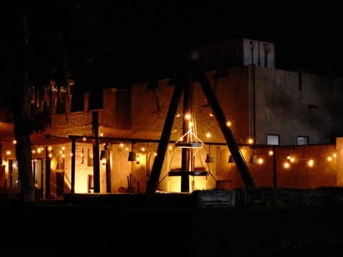
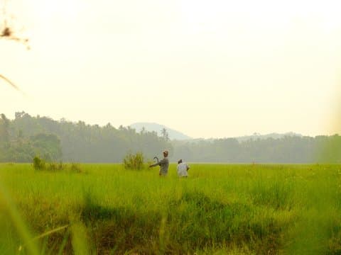
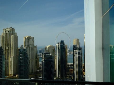
Velvia Punch turns Fujifilm's Velvia simulation into something intensely saturated, contrasty, and unmistakably green. The Custom Kelvin setting of 6590K paired with an R-9 shift pushes red as far down as the scale allows, giving the recipe its striking green cast across urban architecture and waterfront scenes. DR200, Highlight +2, Shadow +2, and Color +4 add further punch, while Strong Color Chrome FX and Blue FX deepen the colour character. It is made for scenes where bold colour matters more than natural restraint.
아래 값을 모두 카메라의 커스텀(C1–C7) 프리셋에 입력하세요. 순서는 x-trans-iv 바디의 커스텀 설정 편집/저장 메뉴와 같습니다.
| 항목 | 값 | 복사 |
|---|---|---|
| Film Simulation | Velvia | |
| Dynamic Range | DR200 | |
| Highlight | +2 | |
| Shadow | +2 | |
| Color | +4 | |
| Sharpness | +1 | |
| Noise Reduction | -4 | |
| Clarity | 0 | |
| Grain Effect | Weak | |
| Grain Size | Small | |
| Color Chrome FX | Strong | |
| Color Chrome FX Blue | Strong | |
| Monochromatic Color | WC 0 / MG 0 | |
| White Balance | Custom Kelvin (6590K) | |
| WB Shift | R -9 / B 0 | |
| ISO | up to ISO 6400 | |
| Exposure Compensation | 0 to +2/3 |
x-trans-iv, x-trans-v and gfx 센서에 맞춰 만들었습니다. 아래 바디에서 검증했습니다.
Velvia Punch channels the vintage look of classic Velvia film, renowned for its bold, eye-catching colours and strong contrast. This recipe accentuates vibrant hues with a rich saturation, making it perfect for outdoor scenes where nature's palette shines brightest. Expect greens to pop with life and blues to appear deep and inviting. Its strong colour chrome effects add depth, turning everyday scenes into striking compositions. While the highlights and shadows are pushed to illuminate and define, the overall image remains smooth, thanks to the subtle grain. It excels in transforming mundane settings into visually arresting vistas.
Ideal for bright, outdoor settings where you want to capture nature's vibrancy. Perfect for landscapes and saturated environments. Avoid using in low contrast or indoor settings where skin tones are important. The recipe excels in bringing out the drama in skies and foliage.
필름 시뮬레이션이나 분위기가 비슷하거나, 같은 센서를 겨냥한 라이브러리의 다른 레시피입니다.