본문으로 건너뛰기
Pro recipex-trans-vCLASSIC NEGATIVE

Superia Almanac

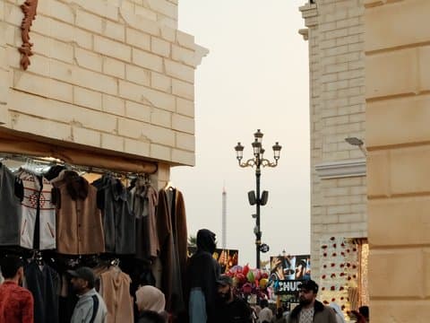
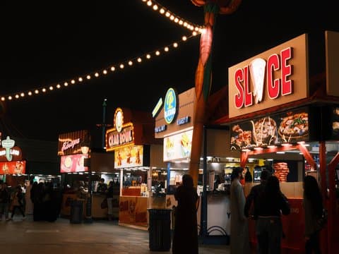
Subdued shadows paired with rich hues create an inviting calm for urban exploration.
예시 사진촬영 그대로

설정하기 전에 결과부터 확인하세요.

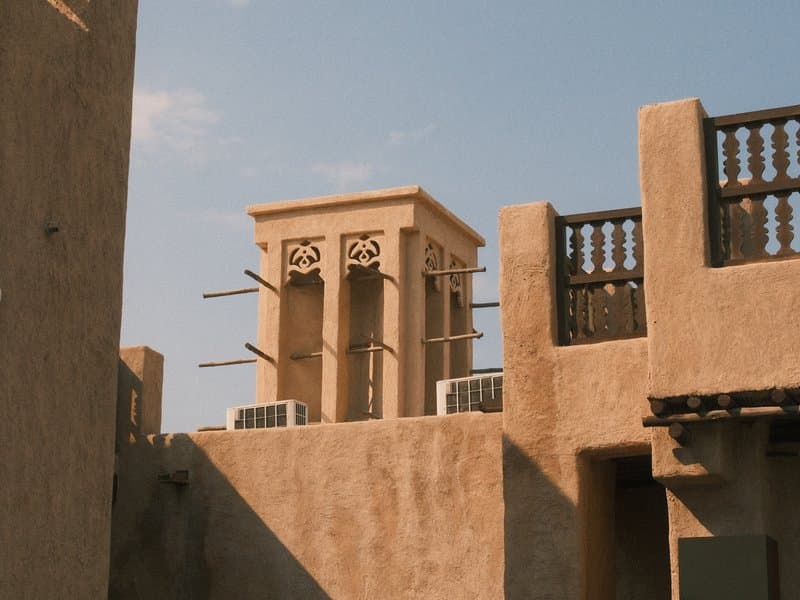
A traditional architectural structure with a wind tower against a clear blue sky.
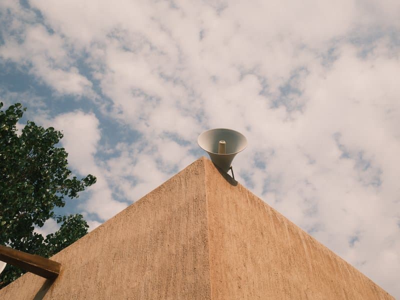
A close-up view of a building's corner with a speaker on top against a cloudy sky.
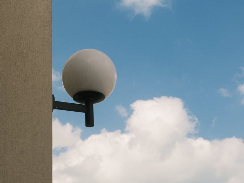
A round light fixture mounted on a wall against a blue sky with fluffy white clouds.
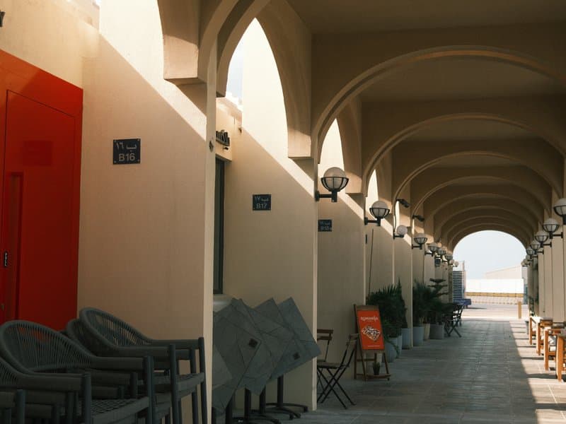
A corridor with arches and light fixtures, featuring empty chairs and a view of the sea in the distance.

Unedited JPEGs from x-trans-v bodies — straight out of camera.

이 레시피에 대해

Superia Almanac gives modern city scenes a distinctly film-like pulse, pairing rich reds and warm colour with skies that stay calm and restrained. Built on Classic Negative, it has a character that feels especially convincing when architecture, hard light, and changing shadows share the frame. The subtle grain adds just enough texture to keep the image from feeling overly clean, while muted blues bring a cooler counterpoint to the warmth. It is a strong choice for urban exploration, particularly when the light is anything but predictable.

섹션 01Pro

전체 설정값

This is a FujiPic Pro recipe. The film simulation is on the house; the other 15 settings unlock with Pro.

항목값복사
Film SimulationClassic Negative
Dynamic Range
Highlight
Shadow
Color
Sharpness
Pro recipe15 settings hidden

The rest of this recipe is Pro.

Unlock every value for Superia Almanac — and every other premium recipe in the library.

Already Pro? Sign in
  • Every setting, unlockedAll premium recipes, every value.
  • Match any photoUpload a photo, get the recipe behind it.
  • Your own collectionsOrganise recipes the way you shoot.
  • Unlimited savesKeep every look you love.
섹션 02

호환성

x-trans-v and gfx 센서에 맞춰 만들었습니다. 아래 바디에서 검증했습니다.

센서

카메라

촬영 노트

이 레시피가 빛나는 순간.

Superia Almanac channels the essence of Fujifilm's classic print films, delivering images with rich, vibrant colours and a slightly nostalgic feel. Reds pop with warmth, and blues take on a charming, muted hue. Skies are softened, preserving detail even in bright conditions. This recipe excels in urban environments, where its dynamic range can handle contrasting light and shadow, offering a cinematic quality that is both modern and timeless. The subtle grain adds texture without overwhelming, while the cool colour shift introduces a unique atmosphere that feels fresh yet familiar. Ideal for capturing the lively bustle of city streets or the serene calm of architectural scenes, this recipe thrives when you want to inject warmth and character into your images.

Perfect for street photography and urban exploration, especially under overcast or harsh midday sunlight. While it enhances warmth and vibrancy in architecture, it may not suit controlled studio environments or pure landscapes lacking urban elements. Its nostalgic tone adds depth.

강점

  • ✓Preserves highlight details beautifully
  • ✓Warm tones enhance urban scenes
  • ✓Subtle grain adds texture
  • ✓Rich reds and muted blues

주의할 점

  • !Cool WB shift may affect skin tones
  • !Not ideal for pure landscapes
  • !Potentially flat in studio settings
자주 묻는 질문

이 레시피에 대하여.

Superia Almanac is designed for Fujifilm X-Trans V and GFX sensors. The tested cameras include the X-E5, X-H2, X-H2S, X-M5, X-S20, X-T30 III, X-T5, X-T50, X100VI, GFX100 II, GFX100RF, and GFX100S II.
It means the recipe is intended to retain useful detail in brighter parts of high-contrast scenes rather than letting highlights dominate the frame. That makes the character particularly relevant to architectural compositions and sky-heavy scenes like those shown in the sample photos.
Superia Almanac is at its best around architecture, city streets, and urban details where warm colour and restrained blues can shape the atmosphere. It also works well when buildings, open skies, and changing light share the frame, giving everyday urban scenes a nostalgic character without making them feel overly stylized.
It can be used for urban portraits, but it is not the strongest portrait-focused choice. The recipe has a warm white balance shift that may affect skin tones, while its documented strengths are more closely tied to architecture, urban scenes, warm colour, and rich reds with muted blues.
Controlled studio settings and pure landscapes are the clearest situations to avoid. The recipe can look flat in studio environments, while the shooting notes specifically say it is not ideal for landscapes that lack urban elements, making architecture and city surroundings a better match for its character.