Classic Negative
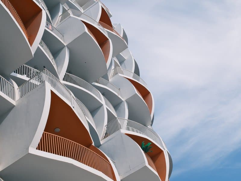
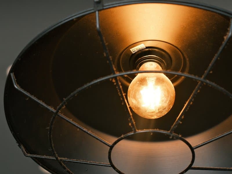
Unedited JPEGs from x-trans-iv bodies — straight out of camera.
아래 값을 모두 카메라의 커스텀(C1–C7) 프리셋에 입력하세요. 순서는 x-trans-iv 바디의 커스텀 설정 편집/저장 메뉴와 같습니다.
| 항목 | 값 | 복사 |
|---|---|---|
| Film Simulation | Classic Negative | |
| DR Priority | Auto | |
| Highlight | 0 | |
| Shadow | 0 | |
| Color | +3 | |
| Sharpness | -3 | |
| Noise Reduction | -4 | |
| Clarity | +3 | |
| Grain Effect | Weak | |
| Grain Size | Small | |
| Color Chrome FX | Weak | |
| Color Chrome FX Blue | Weak | |
| Monochromatic Color | WC 0 / MG 0 | |
| White Balance | Daylight | |
| WB Shift | R -2 / B +3 | |
| ISO | up to ISO 6400 | |
| Exposure Compensation | -1/3 to +1/3 |
x-trans-iv and gfx 센서에 맞춰 만들었습니다. 아래 바디에서 검증했습니다.
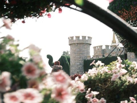
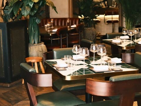
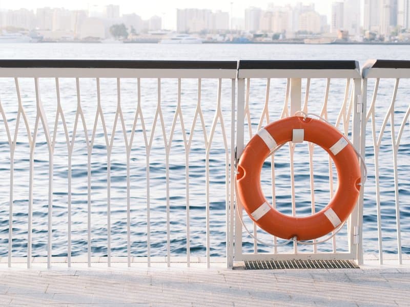
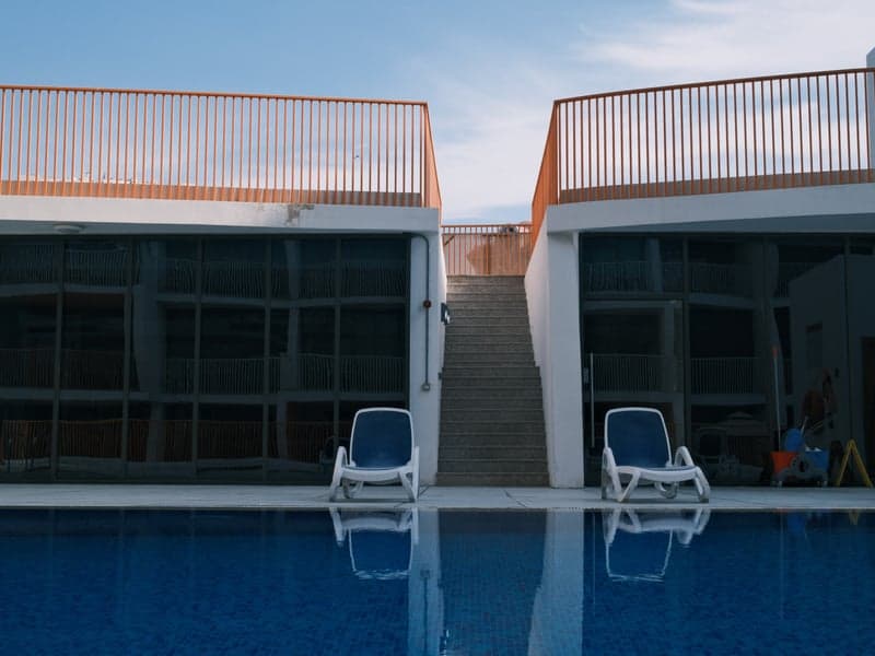
Coral Negative takes its cues from everyday colour negative film as it looks straight off a lab scanner: crisp, slightly cool and full of colour. Classic Negative lays the foundation, with its trademark cyan shadows and warm highlights, and a daylight white balance pushed towards blue gives the whole frame a clean, cool undertone. Saturation is raised so coral reds, teals and greens stand out, and subtle chrome effects hold detail in the richest hues. Contrast is managed automatically by Dynamic Range Priority, keeping both skies and shadows in check. Clarity is lifted for midtone punch while sharpening is reduced, which gives a structured yet natural texture closer to a scanned negative than a crisp digital file. A light, fine grain finishes the look. It flourishes in golden-hour architecture, coastal walks and urban corners, where warm light meets cool shade.
Coral Negative shines on streets, around architecture and on the coast, particularly in golden light or under overcast skies where its cool cast and vivid colour add energy. Skip it for studio portraits, where the cool tint chills skin, and for pure landscapes that need neutral, natural colour.
필름 시뮬레이션이나 분위기가 비슷하거나, 같은 센서를 겨냥한 라이브러리의 다른 레시피입니다.