Classic Negative
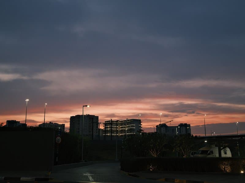
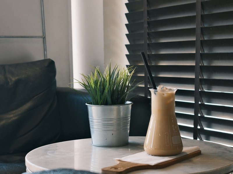

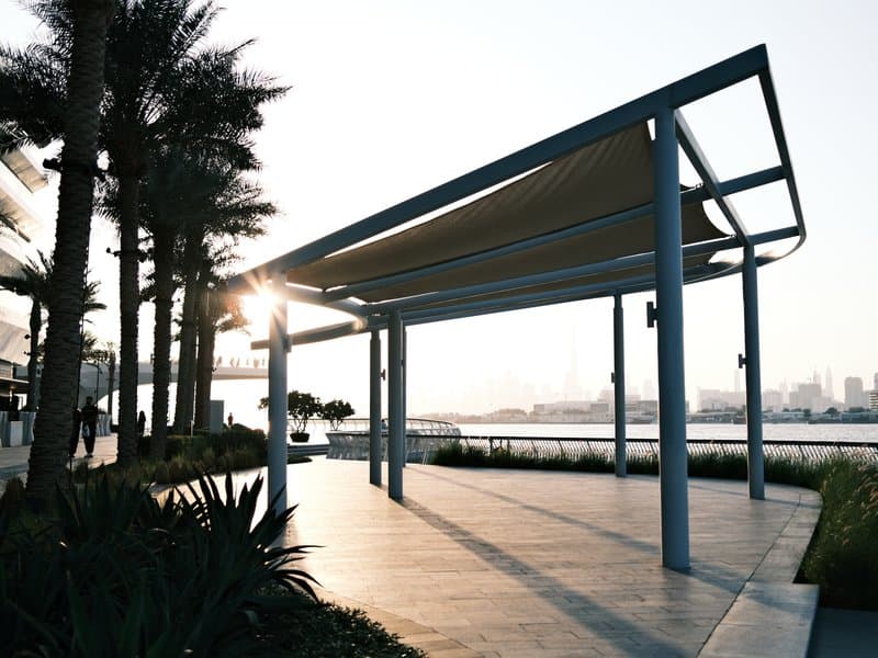
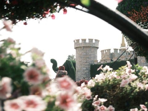
Unedited JPEGs from x-trans-iv bodies — straight out of camera.
Trage jeden Wert unten in ein Custom-Preset (C1–C7) deiner Kamera ein. Die Reihenfolge entspricht dem Menü Eigene Einstellungen bearbeiten/speichern auf x-trans-iv-Gehäusen.
| Parameter | Wert | Kopieren |
|---|---|---|
| Film Simulation | Classic Negative | |
| DR Priority | Auto | |
| Highlight | 0 | |
| Shadow | 0 | |
| Color | +3 | |
| Sharpness | -3 | |
| Noise Reduction | -4 | |
| Clarity | +3 | |
| Grain Effect | Weak | |
| Grain Size | Small | |
| Color Chrome FX | Weak | |
| Color Chrome FX Blue | Weak | |
| Monochromatic Color | WC 0 / MG 0 | |
| White Balance | Daylight | |
| WB Shift | R -2 / B +3 | |
| ISO | up to ISO 6400 | |
| Exposure Compensation | -1/3 to +1/3 |
Für x-trans-iv and gfx-Sensoren entwickelt. An den unten genannten Gehäusen getestet.
Superia Print is inspired by the look of Fujifilm's consumer colour negatives as they appear after a lab scan. Classic Negative provides the familiar cyan-leaning shadows and warm-cool separation, while a daylight white balance nudged towards blue lends a cool, fresh cast. Colour saturation is boosted, so greens, teals and reds read confidently without tipping into garishness, and gentle chrome effects add depth to saturated areas. The tonal curve is left to Dynamic Range Priority, which balances highlights and shadows automatically. An unusual pairing of added clarity with reduced sharpening gives midtones punch and structure while edges stay free of harsh digital halos, closer to the texture of a scan than a sharpened file. Light, fine grain keeps things subtle. It sings in golden-hour streets and architecture, where warm light meets cool shadows for a lively, contrasty scanned-film feel.
Superia Print is great for street, urban and architectural scenes, particularly at golden hour or on overcast days where its cool cast and bold colour add life. Avoid it for studio portraits, where the cool tint is unflattering, and for pure landscapes that need a neutral, natural rendering.
Weitere Rezepte der Bibliothek mit ähnlicher Filmsimulation, Stimmung oder Sensor-Ausrichtung.