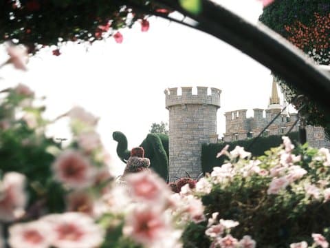
Classic Negative
Soft, nostalgic tones with a subtle grain for a timeless feel
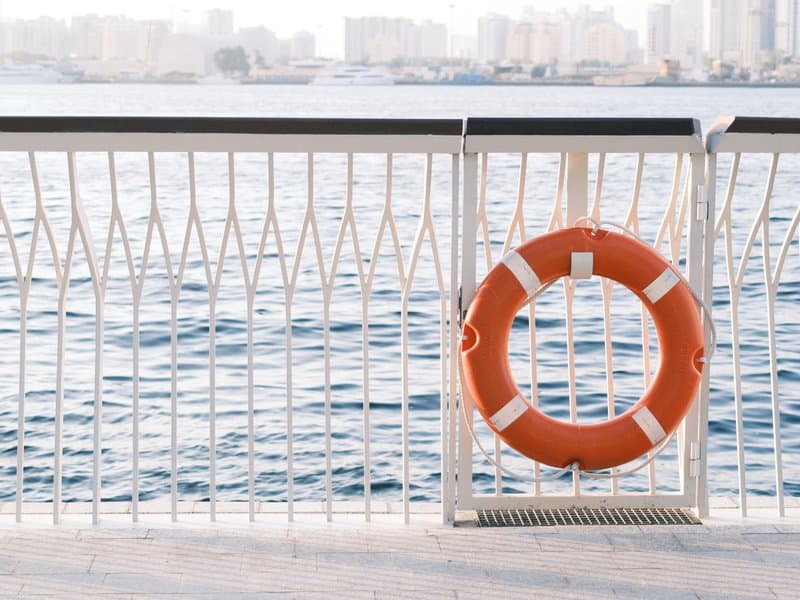
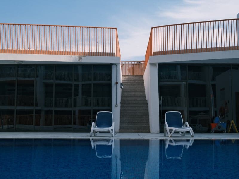
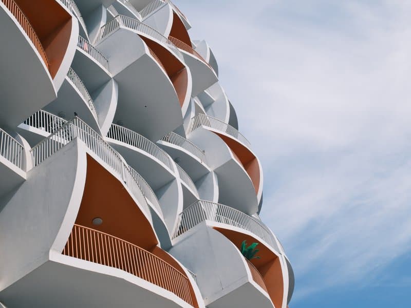
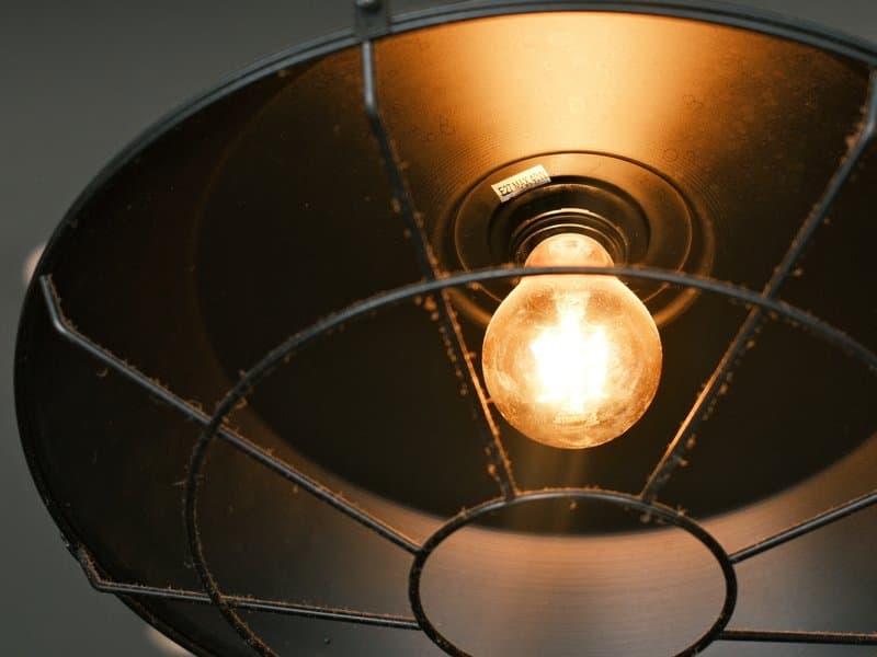
Unedited JPEGs from x-trans-iv bodies — straight out of camera.
Coral Negative gives warm light a cooler edge, making golden-hour colour feel crisp, vivid, and distinctly film-like. Built on Classic Negative, it combines punchy colour with a structured scanned-negative texture, letting coral reds, teals, and greens stand out without turning the frame overly digital. It feels especially natural around waterfronts, modern architecture, and city streets, where warm highlights meet cooler shade. The look is energetic without being loud. Studio portraits are less convincing because the cool tint can noticeably chill skin tones.
把下面的每个数值输入相机的自定义预设(C1–C7)。顺序与 x-trans-iv 机身的编辑/保存自定义设置菜单一致。
| 参数 | 数值 | 复制 |
|---|---|---|
| Film Simulation | Classic Negative | |
| DR Priority | Auto | |
| Highlight | 0 | |
| Shadow | 0 | |
| Color | +3 | |
| Sharpness | -3 | |
| Noise Reduction | -4 | |
| Clarity | +3 | |
| Grain Effect | Weak | |
| Grain Size | Small | |
| Color Chrome FX | Weak | |
| Color Chrome FX Blue | Weak | |
| Monochromatic Color | WC 0 / MG 0 | |
| White Balance | Daylight | |
| WB Shift | R -2 / B +3 | |
| ISO | up to ISO 6400 | |
| Exposure Compensation | -1/3 to +1/3 |
为 x-trans-iv and gfx 传感器设计,已在下列机身上测试。
Coral Negative takes its cues from everyday colour negative film as it looks straight off a lab scanner: crisp, slightly cool and full of colour. Classic Negative lays the foundation, with its trademark cyan shadows and warm highlights, and a daylight white balance pushed towards blue gives the whole frame a clean, cool undertone. Saturation is raised so coral reds, teals and greens stand out, and subtle chrome effects hold detail in the richest hues. Contrast is managed automatically by Dynamic Range Priority, keeping both skies and shadows in check. Clarity is lifted for midtone punch while sharpening is reduced, which gives a structured yet natural texture closer to a scanned negative than a crisp digital file. A light, fine grain finishes the look. It flourishes in golden-hour architecture, coastal walks and urban corners, where warm light meets cool shade.
Coral Negative shines on streets, around architecture and on the coast, particularly in golden light or under overcast skies where its cool cast and vivid colour add energy. Skip it for studio portraits, where the cool tint chills skin, and for pure landscapes that need neutral, natural colour.
库中胶片模拟相近、氛围相似或面向同一传感器的其他配方。