Перейти к основному содержанию
Pro recipex-trans-vREALA ACE

Pro 160 Print

Reala Ace offers a balanced harmony of warm and calm tones with subtle grain, ideal for capturing natural skin tones.
Примеры кадровПрямо из камеры

Посмотрите, как это выглядит, прежде чем вносить.

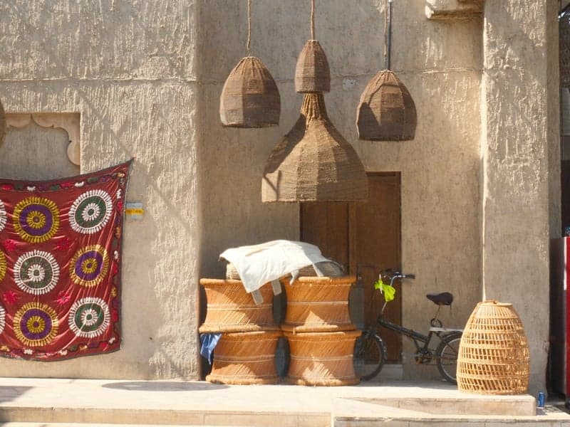
A rustic scene featuring woven baskets, a bicycle, and colorful textiles hanging on a wall.
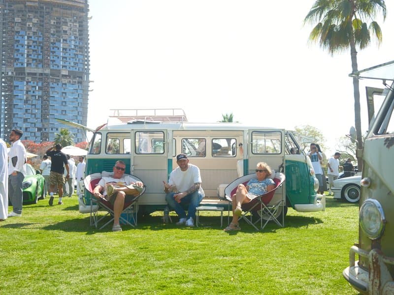
Three people sitting in front of a vintage Volkswagen bus on a sunny day at an outdoor event.
A vintage green Volkswagen van parked under palm trees with people inside, bright sunny day.
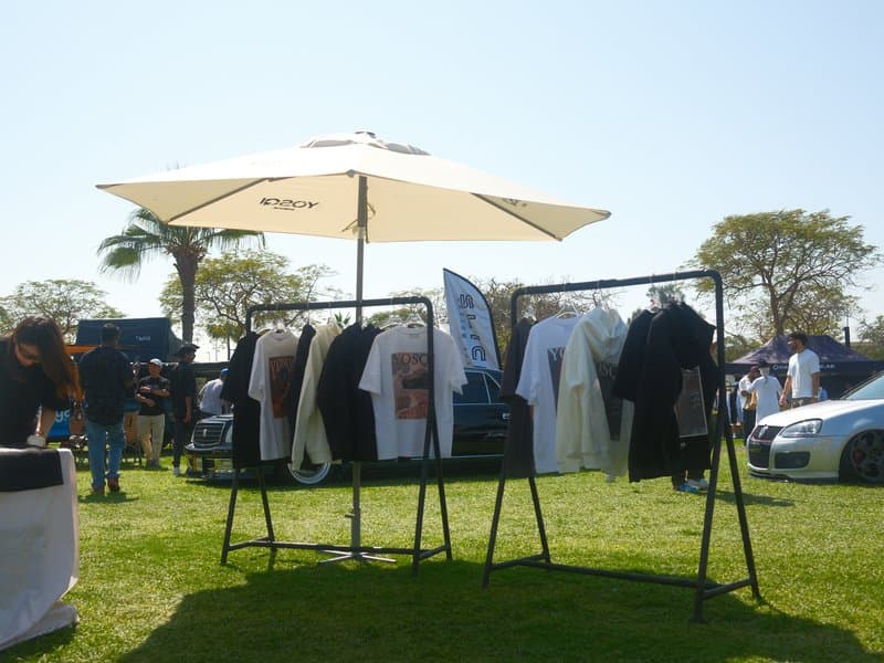
Clothes displayed on racks under a large umbrella at an outdoor market on a sunny day.

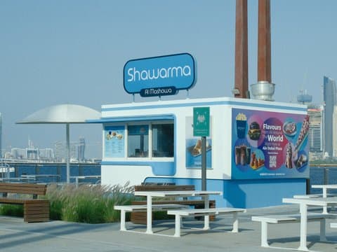
Unedited JPEGs from x-trans-v bodies — straight out of camera.

Об этом рецепте

Pro 160 Print brings a sun-warmed, nostalgic character to everyday photography, balancing lively colour with the gentle feel of classic print film. Its Reala Ace foundation gives the look a natural starting point, while subtle grain adds texture without taking attention away from the subject. Think relaxed summer outings, outdoor portraits, and travel scenes filled with colour. Bright natural light is where this recipe feels most at home, though high-contrast scenes can make its softer tonal balance harder to maintain.

Раздел 01Pro

Все настройки

This is a FujiPic Pro recipe. The film simulation is on the house; the other 15 settings unlock with Pro.

ПараметрЗначениеКопировать
Film SimulationReala Ace
Dynamic Range
Highlight
Shadow
Color
Sharpness
Pro recipe15 settings hidden

The rest of this recipe is Pro.

Unlock every value for Pro 160 Print — and every other premium recipe in the library.

Already Pro? Sign in
  • Every setting, unlockedAll premium recipes, every value.
  • Match any photoUpload a photo, get the recipe behind it.
  • Your own collectionsOrganise recipes the way you shoot.
  • Unlimited savesKeep every look you love.
Раздел 02

Совместимость

Рассчитан на сенсоры x-trans-v and gfx. Проверен на камерах ниже.

Сенсоры

Камеры

Заметки со съёмки

Когда этот рецепт раскрывается.

Pro 160 Print channels the look of classic film, offering a warm, nostalgic atmosphere with a lively undertone. The colours are vibrant yet natural, with an emphasis on warm tones that enrich skin, foliage, and automotive subjects alike. Its unique character comes from a soft contrast that maintains details in the highlights and shadows, giving images a gentle, luminous quality. The overall effect is reminiscent of sun-drenched afternoons captured on vintage film, where every shade of green pops with life. The fine grain is subtle, adding a touch of texture without overwhelming the image, perfect for capturing the essence of a relaxed summer day. Pro 160 Print truly shines in scenes with plenty of natural light, where its warmth can envelop the subject in a comforting glow.

This recipe excels in outdoor settings, especially for portraits and casual daily scenes. It's ideal for capturing vibrant moments under sunny conditions. Avoid high-contrast scenes, as it may struggle to maintain detail balance. Perfect for leisurely walks in the park.

В чём хорош

  • ✓Warm, vibrant colours with a nostalgic feel
  • ✓Soft contrast preserves highlight details
  • ✓Great for sunny, outdoor portraits
  • ✓Fine grain adds subtle texture

На что обратить внимание

  • !Not for high-contrast scenes
  • !Limited blue tones due to WB shift
  • !Noise reduction may smooth over details
Частые вопросы

Об этом рецепте.

Pro 160 Print is designed for Fujifilm X-Trans V and GFX cameras. Compatible bodies include the X-E5, X-H2, X-H2S, X-M5, X-S20, X-T30 III, X-T5, X-T50, X100VI, GFX100 II, GFX100RF, and GFX100S II. Check your camera's sensor generation before trying the recipe.
Pro 160 Print suits outdoor portraits, casual daily scenes, and relaxed travel photography. Its warm, lively colours work well with people, foliage, and automotive subjects, giving sunlit scenes a nostalgic character. It is particularly useful when you want a classic print-film mood without making everyday colours feel excessively stylised.
The recipe is described as balancing warm, calm tones with natural-looking skin colour. Its soft contrast gives portraits a gentle, luminous quality, while subtle grain adds texture. For the most flattering results, try it in natural light and pay attention to how the warmth interacts with the skin tones in your particular scene.
Bright natural light is the recipe's strongest setting, particularly for outdoor portraits and relaxed summer scenes. The warm colour palette gives sunlit subjects a nostalgic glow, while the softer contrast helps keep the image from feeling too harsh. High-contrast scenes are less suitable because balancing highlight and shadow detail can become more difficult.
Watch for strong contrast, shifts in blue tones, and excessive smoothing of fine details. The recipe's white balance character can limit blue tones, while noise reduction may soften delicate textures. In scenes with bright highlights and deep shadows, check exposure carefully to maintain a balanced result rather than losing important detail.