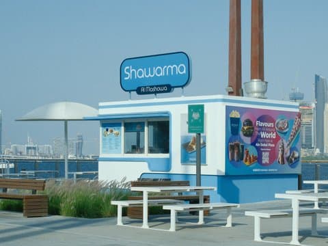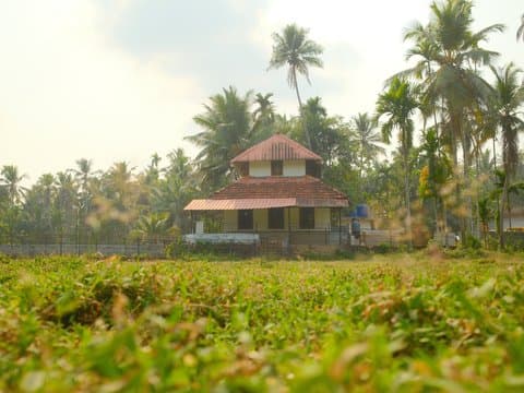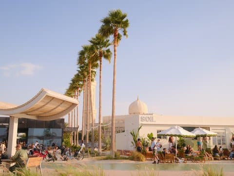
PRO Neg. Hi
Strong grain with a warm colour cast evokes dreamy nostalgia, perfect for capturing serene portraiture.


Unedited JPEGs from x-trans-iv bodies — straight out of camera.
Warm Amber turns PRO Neg. Std into a distinctly nostalgic portrait recipe, pairing soft tonal rendering with deep, textured shadows and a warm colour character. The 7100K white balance and strong red shift push the look toward an inviting amber atmosphere, while DR400 and subdued colour keep the palette restrained. It feels especially natural around quiet subjects, soft indoor light, and golden-hour portraits where gentle highlights and pronounced grain can add emotional depth without making the frame feel overly polished.
Inserisci ogni valore qui sotto in un preset personalizzato (C1–C7) della tua fotocamera. L'ordine corrisponde al menu Modifica/Salva impostazione personalizzata sui corpi x-trans-iv.
| Parametro | Valore | Copia |
|---|---|---|
| Film Simulation | PRO Neg. Std | |
| Dynamic Range | DR400 | |
| Highlight | 0 | |
| Shadow | +3 | |
| Color | -3 | |
| Sharpness | -2 | |
| Noise Reduction | -4 | |
| Clarity | 0 | |
| Grain Effect | Strong | |
| Monochromatic Color | WC 0 / MG 0 | |
| White Balance | Custom Kelvin (7100K) | |
| WB Shift | R +7 / B -5 | |
| ISO | up to ISO 6400 | |
| Exposure Compensation | +1/3 to +1 |
Pensata per sensori x-trans-iv, x-trans-iii and gfx. Provata sui corpi qui sotto.
Warm Amber, built on PRO Neg. Std, wraps your images in a nostalgic warmth reminiscent of film photography. It balances a soft tonal range with a gentle colour palette, perfect for serene, intimate portraits. The highlights are tender, avoiding harshness, while shadows deepen, adding a rich contrast that enhances intricate details. The strong grain imbues a classic filmic texture, especially effective in controlled lighting. It captures the essence of quiet moments and the subtle nuances of studio settings, making each image feel timeless and evocative. This recipe thrives in golden-hour lighting, where its vintage warmth truly resonates, delivering an atmospheric and soulful aesthetic. Its subtle colours and textures evoke memories of a bygone era, perfect for those seeking to add emotional depth to their work.
Warm Amber excels in portraits and studio sessions, especially during golden-hour. Its nostalgic warmth and detail-enhancing contrast flatter serene subjects. It's less suited for vivid landscapes, where its subdued tones might not capture the scene's vibrancy. Try it with soft indoor lighting to create a warm, inviting atmosphere.
Altre ricette della libreria con simulazione pellicola, atmosfera o sensore simili.