Nostalgic Neg.
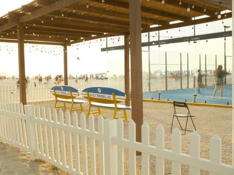
Sepia tones and noticeable grain create a vintage cinematic feel. Perfect for travel and capturing nostalgic moments.
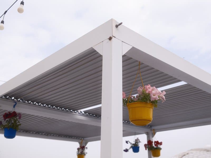
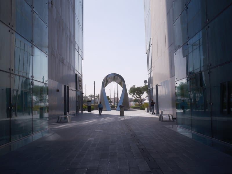
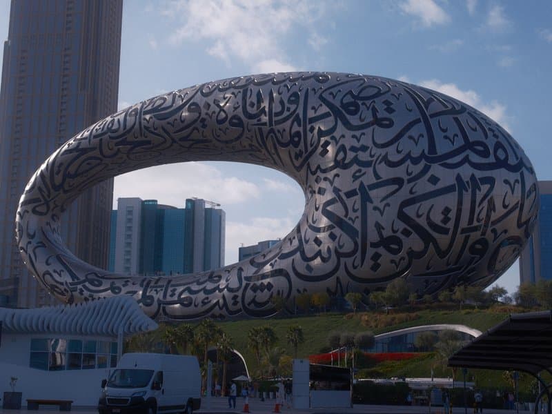
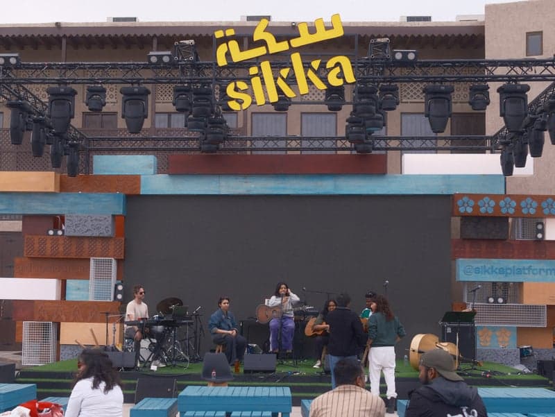
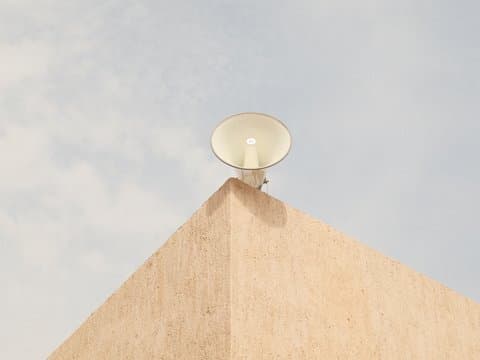
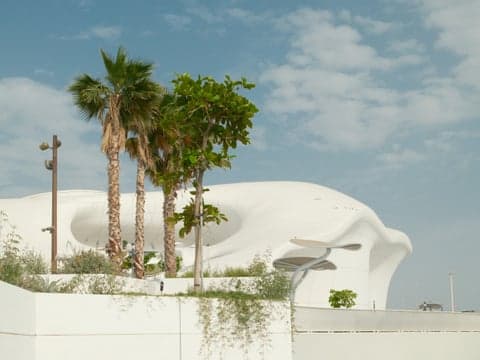
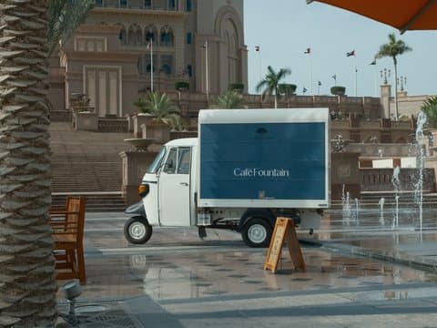
Unedited JPEGs from x-trans-v bodies — straight out of camera.
Matinee Print brings a vintage cinema feel to modern Fujifilm photography, pairing Nostalgic Neg. with restrained colour, pronounced grain, and a gentle fade. Its softened rendering gives architectural details and outdoor performances a timeless quality, while strong Color Chrome adds depth to the colours that remain. The 4900K white balance and matching red and blue shifts contribute to its distinctive tonal character. Try it under overcast skies or during golden hour, when softer light complements its nostalgic look.
Inserisci ogni valore qui sotto in un preset personalizzato (C1–C7) della tua fotocamera. L'ordine corrisponde al menu Modifica/Salva impostazione personalizzata sui corpi x-trans-v.
| Parametro | Valore | Copia |
|---|---|---|
| Film Simulation | Nostalgic Neg. | |
| Dynamic Range | DR400 | |
| Highlight | +3 | |
| Shadow | -2 | |
| Color | -1 | |
| Sharpness | -2 | |
| Noise Reduction | -4 | |
| Clarity | -4 | |
| Grain Effect | Strong | |
| Grain Size | Small | |
| Color Chrome FX | Strong | |
| Color Chrome FX Blue | Off | |
| Monochromatic Color | WC 0 / MG 0 | |
| White Balance | Custom Kelvin (4900K) | |
| WB Shift | R +3 / B +3 | |
| ISO | up to ISO 6400 | |
| Exposure Compensation | -1/3 to -2 |
Pensata per sensori x-trans-v and gfx. Provata sui corpi qui sotto.
Matinee Print, crafted with the Nostalgic Neg. film simulation, conjures a cinematic atmosphere reminiscent of classic films, yet with a vibrant twist. The look features muted colours that evoke a sense of timelessness, while strong colour chrome effects enhance saturation, adding depth and intrigue to your images. With softened shadows, the result is a gentle fade that complements the rich yet restrained palette. This recipe excels in capturing the essence of travel and vintage scenes, where the play of light and shadow can transport viewers to another era. Whether it's the golden glow of an evening or the overcast tones of a serene garden, Matinee Print captures the mood with a nostalgic yet modern flair.
Perfect for capturing the essence of travel and vintage settings under varied lighting conditions. Avoid sharp, modern subjects as the softened contrast may not suit them. Best in overcast or golden-hour lighting to enhance nostalgia. Ideal for creating a dreamy, timeless feel in everyday scenes.
Altre ricette della libreria con simulazione pellicola, atmosfera o sensore simili.