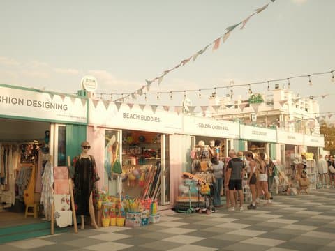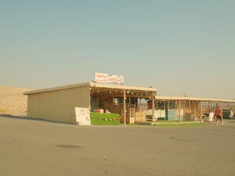
Classic Chrome
Soft film-like tones with gentle warmth and subtle grain texture. Perfect for capturing the essence of everyday life.
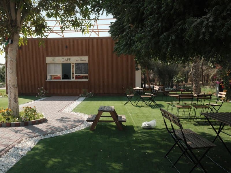
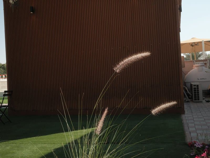
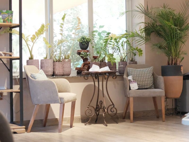
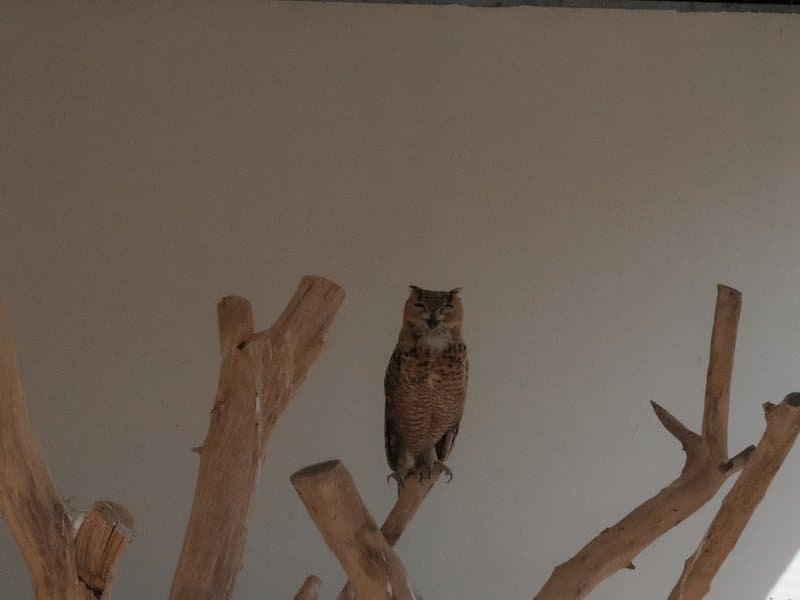
Unedited JPEGs from x-trans-v bodies — straight out of camera.
Quiet Portra 170 gives Classic Chrome a gentle, modern film character, with soft colour, restrained contrast, and a subtle warmth that feels especially natural outdoors. The Daylight white balance with a strong red and negative blue shift brings warmth without increasing the Color setting, which remains neutral at 0. Slightly reduced sharpness and clarity further soften the rendering. It feels particularly at home during golden-hour walks, relaxed café scenes, garden settings, and everyday travel photography where natural colour matters more than punch.
Saisissez chaque valeur ci-dessous dans un préréglage personnalisé (C1–C7) de votre appareil. L'ordre correspond au menu Éditer/Enregistrer réglages personnalisés des boîtiers x-trans-v.
| Paramètre | Valeur | Copier |
|---|---|---|
| Film Simulation | Classic Chrome | |
| DR Priority | Auto | |
| Highlight | 0 | |
| Shadow | 0 | |
| Color | 0 | |
| Sharpness | -1 | |
| Noise Reduction | -4 | |
| Clarity | -2 | |
| Grain Effect | Weak | |
| Grain Size | Small | |
| Color Chrome FX | Weak | |
| Color Chrome FX Blue | Weak | |
| Monochromatic Color | WC 0 / MG 0 | |
| White Balance | Daylight | |
| WB Shift | R +4 / B -5 | |
| ISO | up to ISO 6400 | |
| Exposure Compensation | +1/3 to +1 |
Conçue pour les capteurs x-trans-v and gfx. Testée sur les boîtiers ci-dessous.
Quiet Portra 170 evokes the gentle warmth and subtle vibrancy of classic film stock, with a modern twist that suits digital capture. Colours lean towards a soft glow, giving outdoor and natural scenes an inviting atmosphere. The recipe excels in capturing the relaxed tones of street and travel photography, where the balance between colour richness and subdued highlights allows for a pleasing, nostalgic yet contemporary look. Its subtle vibrancy enhances natural hues without overpowering them, making it ideal for capturing the essence of daily life. While the look is gentle, there's enough contrast to retain detail, particularly in shadows. The softening clarity and eased sharpness contribute to a filmic quality, reminiscent of vintage photographs.
This recipe thrives outdoors in natural light, especially during golden hours. It's perfect for street and travel photography, capturing the warmth of daily life. With its gentle tones, it brings out the best in landscapes and cityscapes. However, it's not ideal for controlled studio portraits, where its natural softness might not suit.
D'autres recettes de la bibliothèque avec une simulation de film, une ambiance ou un capteur proches.